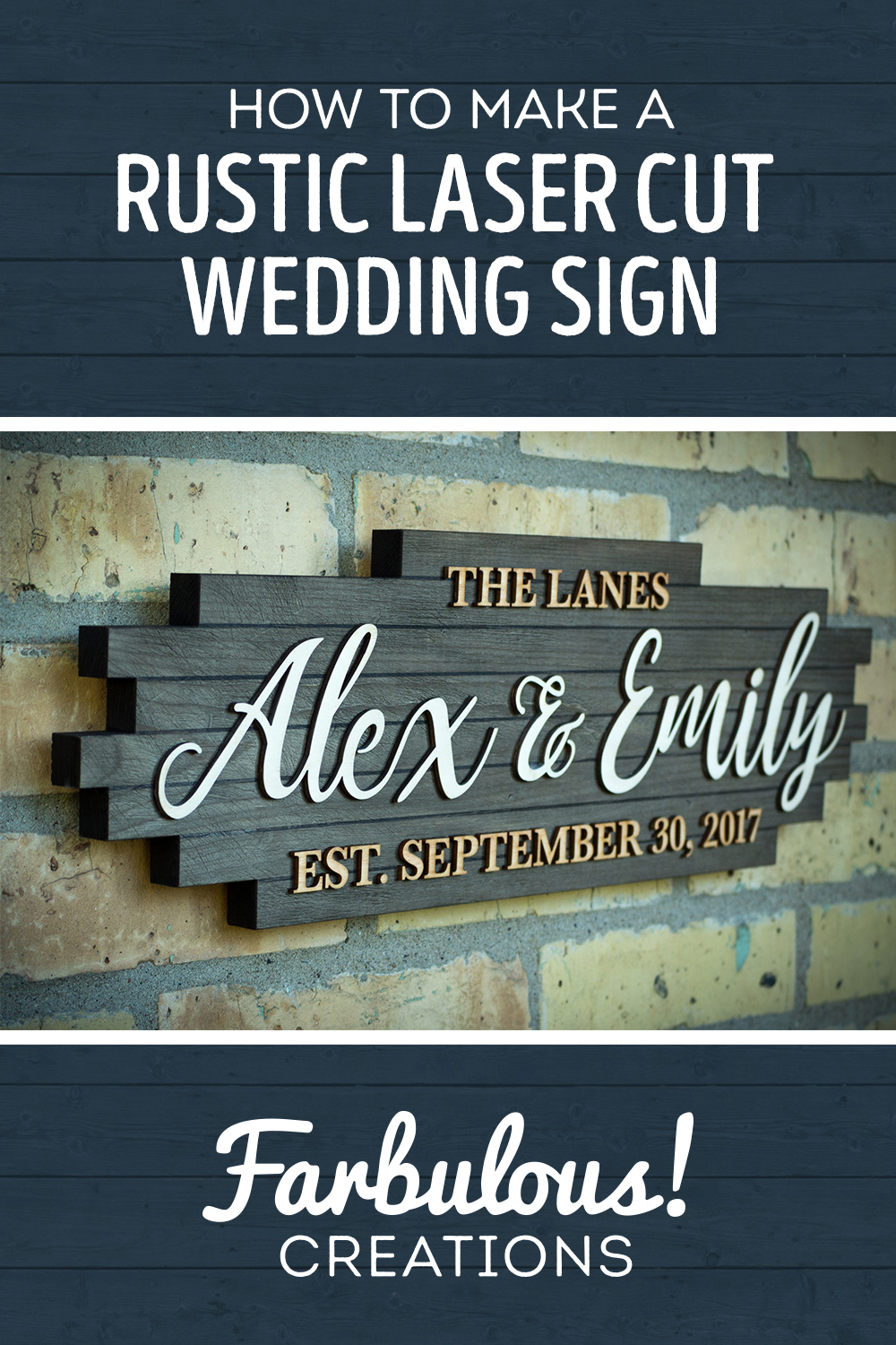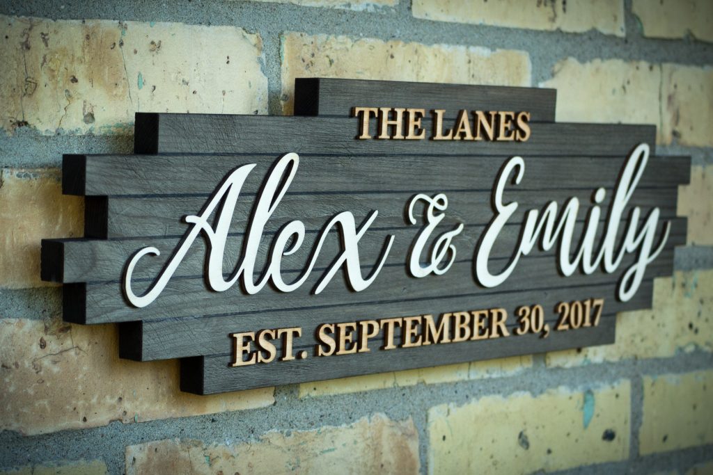
Welcome back to Farbulous Creations! Today we’re going to look back at a project that I actually completed a few years ago as a wedding gift for my cousin and her now-husband, despite just now putting together a build album. You see, I had recorded myself making the sign with the intent on maybe editing it into a video some day and finally got around to it, just shy of two years later. “Eventually!” turns out to be a good slogan. If you’re interested in watching the full build video and listening to my ramblings (instead of reading them), you can do so above.
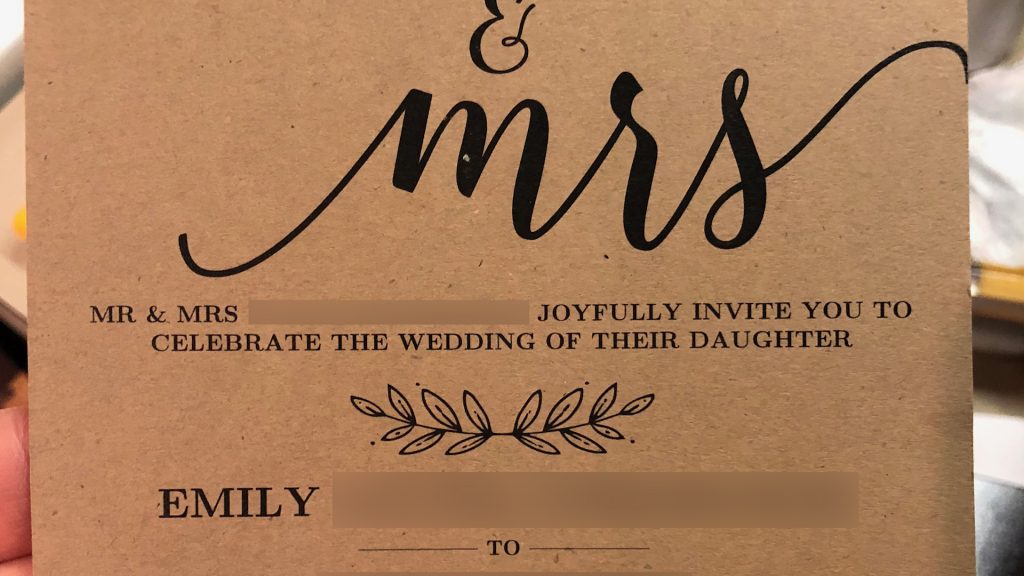
Alex and Emily were having a barn wedding in a semi-rural part of the midwest, so I thought it would be an interesting challenge to design for their theme, which I got a sneak peak of through their invitation. They used one of those sort of Pinterest-y script fonts for primary lettering and a typical serif font for the secondary text. While I really like “rustic chic” decor, it’s not something that I had really done before, so I went through quite a few design iterations.
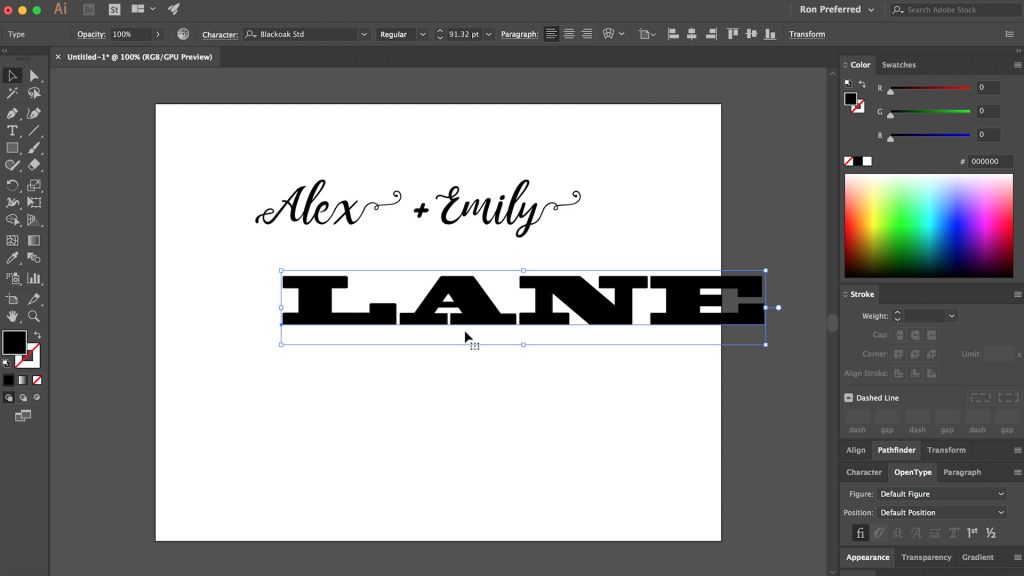
When I make wedding signs, I typically like to make the last name the most prominent part, with the first names above and the date of the wedding below. But this project posed a challenge that I hadn’t really run into before, and that was the shortness of their last name: Lane. Just four letters. It may not be immediately clear why a short name poses a design challenge, but basically you can only scale the last name so big before it just looks awkwardly sized compared to everything else. It has a lot to do with the aspect ratio of the word when typed out; the shorter the name, the closer to square the name is, meaning that as you make the word wider, it gets taller at a much faster rate than a longer name would. I played with kerning a bit and tried a few fonts that were just in-general wider, but I wasn’t happy with either of those options.
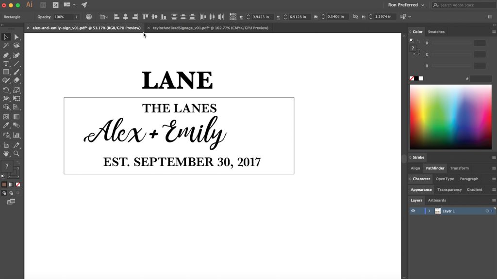
The solution for short last names, as it turns out, was to not make the last name the most prominent focal point, but instead the couple’s first names. The last name was still there, but delegated to the spot above the first names. Since it no longer read fluidly from top to bottom, I thought prepending the word “The” to the front of the last name worked well to highlight the last name in its own way.
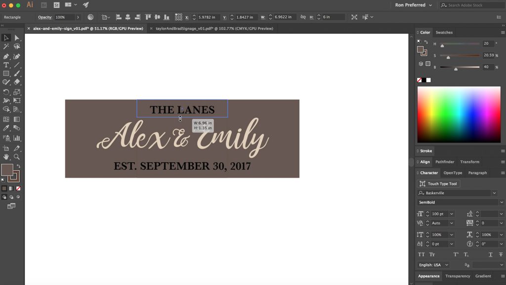
As I’m designing signs like this, I like to plop in temporary colors for what I imagine the final colors will look like in the finished sign to help me get a better sense of where the design is at.
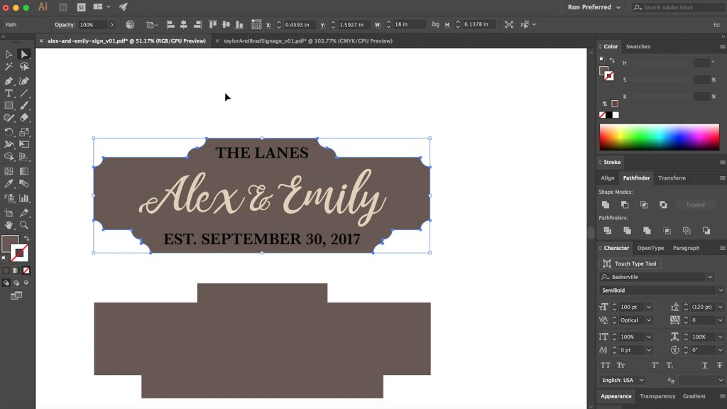
I was also really eager to do something interesting with the shape of the sign itself. I had designed a handful of signs at this point that were pretty formal in their outer shape: inset scooped corners and fancy border radiuses (like you see here). Since this was meant to be more rustic, I thought I would explore a more informal approach to the sign’s overall shape.
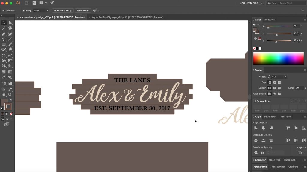
It took me a bit to get there, but being that I was inspired by what I decided to call “rustic barnwood chic”, I decided to try a staggered “plank” look, as though the backing piece was made up of multiple “boards,” even if it wasn’t. I then shuffled the “boards” around until they were perfectly random and I was happy with their positioning.
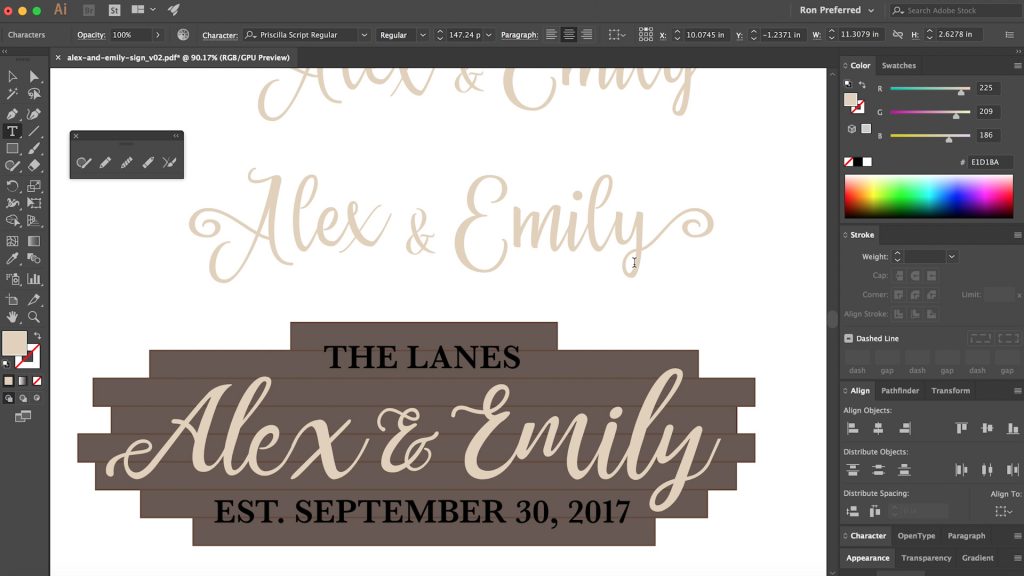
At this point, I started to second guess the typeface I had selected for the primary lettering, mostly because it had a few too many flourishes for my tastes and I wanted to tone that aspect of it down. I tried a few different fonts, but none of them were quite as good as the one I’d already chosen, so I decided to tackle the problem head on and modify the letters I didn’t like.
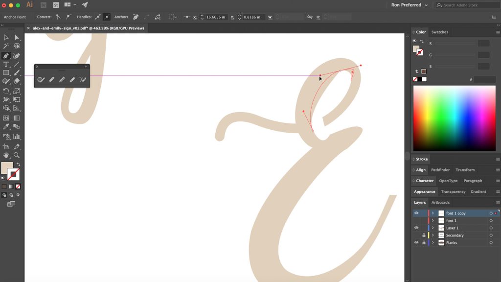
It was primarily the “E” in Emily and the “A” in Alex that I didn’t like, so I went through and removed the extra accents that made the letters “too busy” for me.
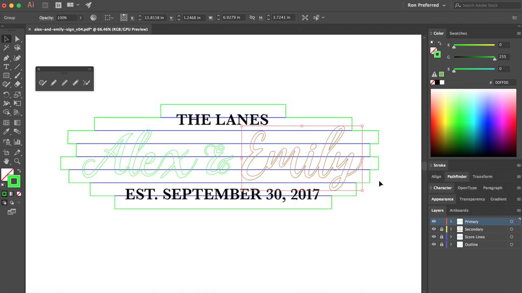
Once I was fully happy with the design, it was time to prep it for the laser cutter.
The laser cutter I use at the maker space I attend is an old Full Spectrum laser and the software is a bit finicky, so proper setup of my file is key. Over the years I’ve learned that shapes can’t have fills and strokes or it will double up the toolpaths and cut everything twice. The same thing happens if the stroke weight in Illustrator is wider than 0.25pt in width.
I like to break my design up into multiple layers so when “printing” from my layered PDF I can choose which layers I want on at a given time; changing the colors of the stroke for each layer also gives me the ability to have different cut settings for each set of toolpaths.
For the dividing lines in between the adjoining planks, I created these from the rectangles themselves before merging a copy of them into one solid chunk. This way the outer backing board could be cut out together, and then the lines could be etched on top to give the appearance of separate pieces of wood. With my file mostly prepped, I was ready to prep my materials.
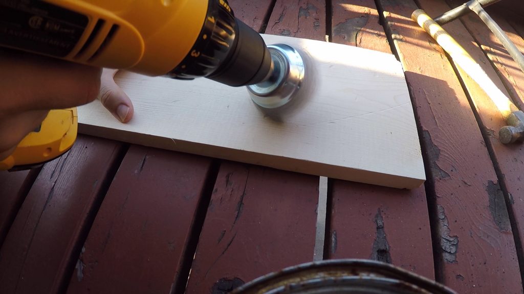
Since the goal of the backing board was to look rustic like barn wood, the challenge was to make that happen without actually having any real legit barnwood at my disposal. I would have to make faux barnwood.
I took a few pieces of pine cut to approximate size and with a wire brush in my drill, took to the boards to heavily distress them. I also beat them up a bit with the back of my hammer, and then smoothed the dents out a bit.
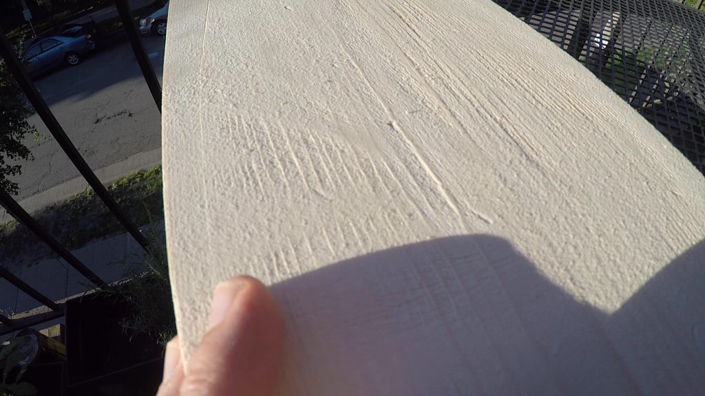
The wire brush was really the key, as it effectively allowed me to sand in between the lines of the grain that made up the earlywood and latewood in the board, as you can see here. This would naturally happen over time in real barnwood, as earlywood is softer and more prone to wear; if you’ve ever encountered an old weathered board, it more than likely had this rigid bumpy grain that you could feel with your hand.
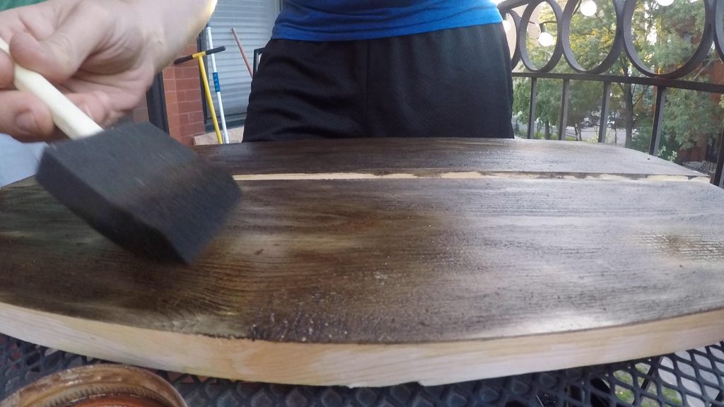
With the board properly textured, it was time to give it the right color too. This is just a teaser shot as I explain the finish a bit, so the next few photos skip back to explain what happened before this shot. FYI.
I’d researched a handful of ways in which you could faux-age wood, but a common theme was iron acetate, which may sound fancy but is simply steel wool dissolved in vinegar. Unfortunately I didn’t take pictures of making it, but I store my solution in a mason jar, and it smells exactly like you think it would: rusty pickles. There’s a free band name for whoever wants it.
There’s a chemical reaction that people smarter than me can explain better than me, but the way I understand it, tannins in the wood react with this iron acetate to darken and grey the wood. Certain woods have a really high tannin content, such as oak, while other woods, like pine, have a lower tannin content.
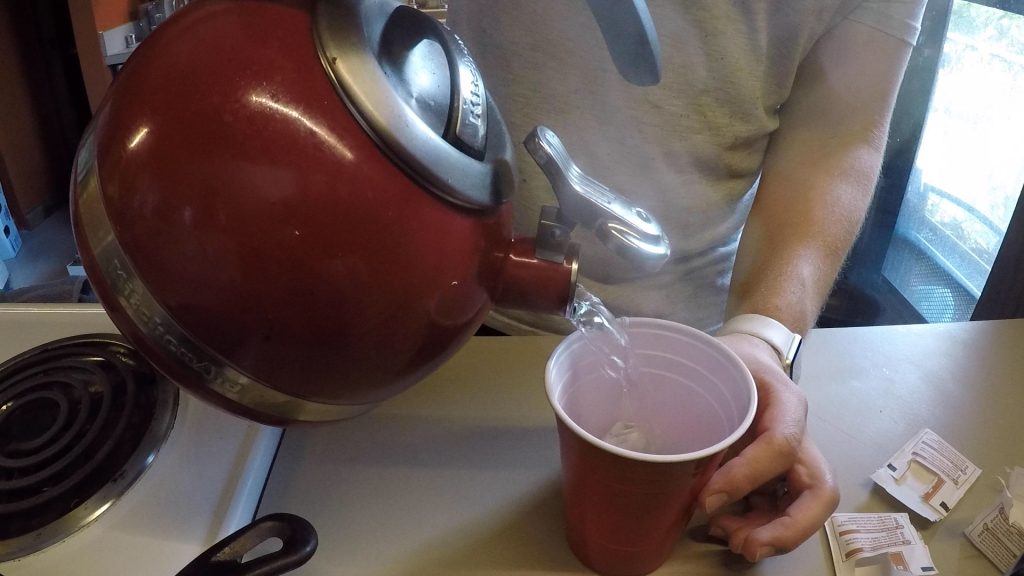
For this project, I needed to use pine though, which I’ll explain why later, but thankfully there’s a way to help supplement the pine’s lackluster tannin content with a simple cup of piping hot strong black tea.
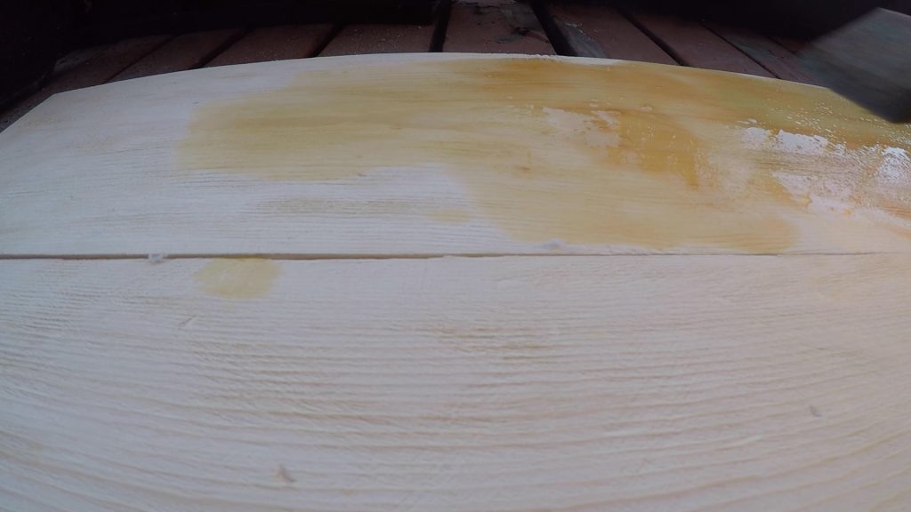
Tea is loaded with the stuff – tannins that is – and so before applying the iron acetate, a healthy coat of tea is applied first.
After the tea had soaked in and dried, it was time for the magic of iron acetate and tannins to do their work. What goes on relatively lightly is transformed to a dark pigment literally before your eyes and is really quite neat to watch. It also gets a bit darker as it completes its reaction and dries, so don’t fret if you try this and it’s not super dark right away.
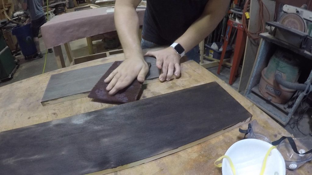
In my case, I felt it was too dark after drying, so I decided to “sand” it back a little bit with a brillo pad. This took off a good amount of the finish without being so aggressive that it exposed the bare wood underneath like sandpaper would.
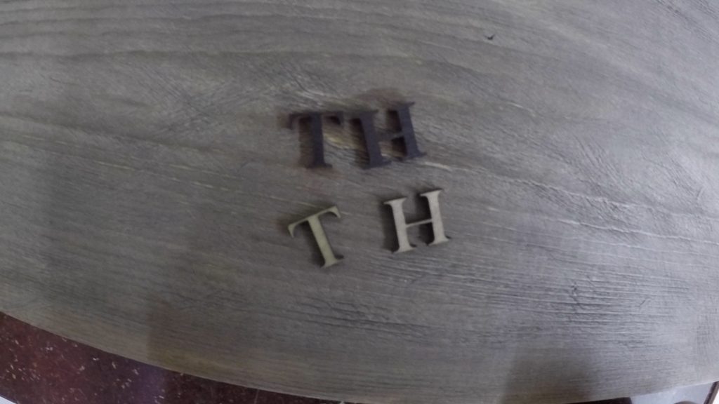
In my design file, I originally imagined the secondary lettering – their last name and wedding date – to be black, but I was aware that it might be too dark to read easily or clearly so I did a test cut with bare wood and another test cut with dark stained wood. The dark stained wood didn’t have the contrast I wanted so I decided to use the lighter stuff.
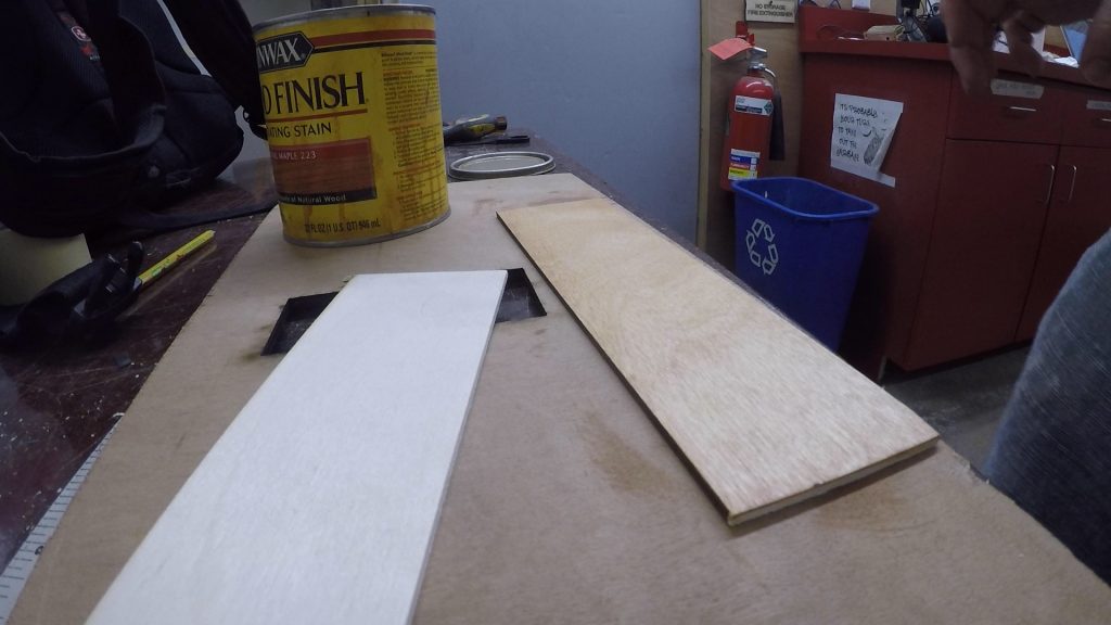
But since I was also using light colored wood for the primary lettering – their first names – I didn’t want it to be identical in color, so I used a light colored stain to give the birch plywood a Colonial Maple golden hue for just a slight bit of contrast. Here’s the unfinished birch and the stained piece for comparison.
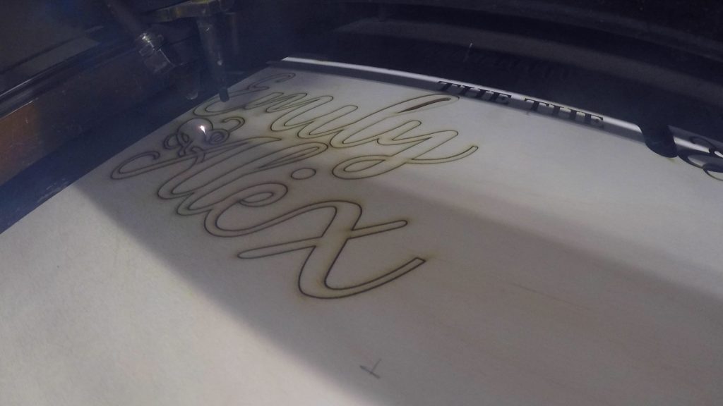
Laser time! I didn’t talk about it in my design process stills, but I will often gather and rearrange the various cut pieces to optimize space on a piece of wood as to minimize my scrap. Here you can see the ampersand getting nice and cozy with the Alex and Emily pieces.
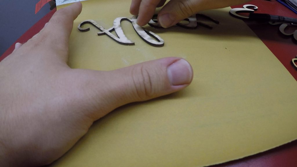
Most pieces coming out of the laser need a bit of sanding to remove smoke that settles on the surface of the wood near the cuts. This can be reduced by good air assist blowing at the wood as it cuts and by good ventilation to suck the smoke out of the laser. But it will always happen a little bit and it’s nothing a good sanding can’t fix. Larger sheets of sandpaper help for this.
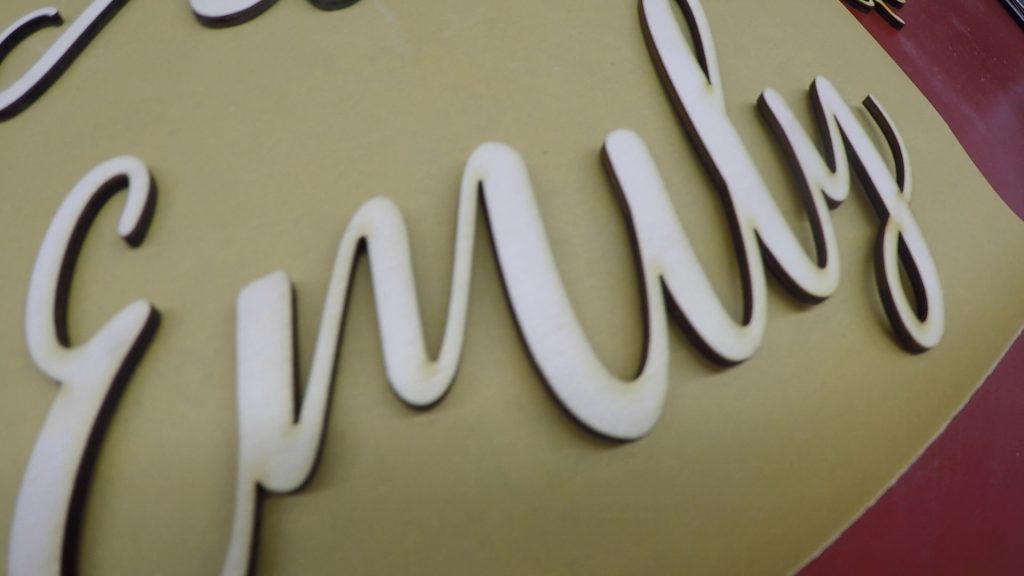
I will occasionally leave a faint hint of the smoke visible to kind of let the finished piece “own its origin” so to speak.
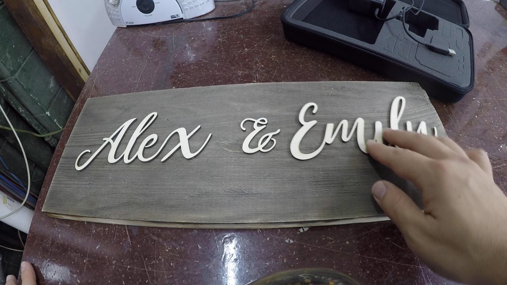
After confirming the lettering looked good on the prepared backing board, it was time to cut that next.
So I mentioned earlier that it was important to be able to use pine for the backing board. Let me explain why. Most laser cutters can only cut wood that’s around a 1/4 inch or thinner, even more so for hardwoods. There just isn’t enough energy to cut past that thickness very cleanly. Well I wanted this sign to have a little heft so I used a 3/4 inch piece of pine. In past experiments I discovered pine was exempt from that 1/4 inch guideline since it was so soft… the laser could essentially cut it like butter. But there was a little trick I used to make the cut cleaner.
Laser light is a super focused light beam, but because it’s super focused, the range where the light energy is at its peak power is pretty tight, especially in a laser cutter where the light is bounced around on a handful of mirrors and then finally refocused before making its way to the wood. As a result, if you could see it with your naked eye, the beam forms sort of an hourglass shape, essentially two cones. Where those two cones meet in the middle is where the light is most focused and you get the cleanest cuts. But the areas immediately above and below the cone still have quite a bit of energy, just not as much.
So with that little lesson of laser light in mind, normally when you’re cutting a piece of 1/8 inch or 1/4 inch wood, for example, you would focus the laser on the surface of the wood to get the sharpest line possible. But since this 3/4 inch piece of pine was quite a bit thicker than normal cutting thickness, I learned to focus the laser in the middle of the board. I did this by focusing on the surface of the wood first, and then raising the cut bed by 3/8 of an inch – exactly half the thickness of my board – so that the tightest focus of energy would be at the center, therefore splitting the difference of “dissipated” energy to be a little bit on both the top and bottom of my board.
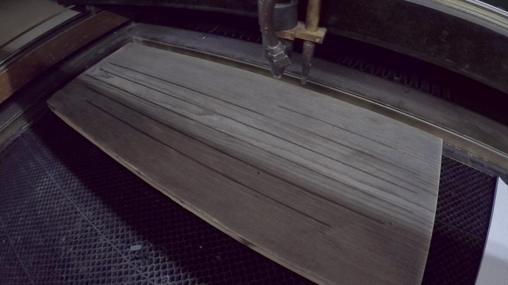
I should note that I also used the slight “defocusing” technique to laser the lines in between the boards – by having the laser even further out of focus, I think nearly 3/4 of an inch it was, and turning the power down pretty low, I was able to get a nice thick dark line that scorched the top of the wood instead of what would have otherwise been a thin tiny cut line in the surface. I did this before cutting the outline.
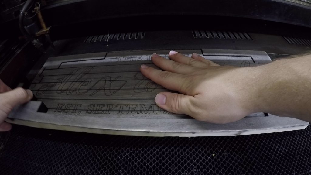
After the outline was cut, I very lightly lasered a copy of the primary and secondary text paths on top of the board to serve as guides for myself when gluing to ensure everything was glued where it needed to be.
When it comes to thick cuts like this, it’s not always clear right away if the laser made it all the way through – even with our little defocusing technique – or if another pass is needed to finish the cut. In these cases, I’m always careful to hold the piece firmly in place as I make sure the scrap comes loose of it. This way I don’t accidentally move the board should it need to be in the same spot for another pass. In this case, it was all good so I was able to remove the cut backing board to inspect my work.
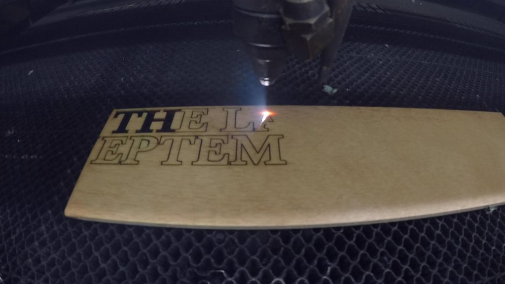
The final pieces to cut were my golden-stained secondary lettering, which I had also prepped to optimize space on my wood.
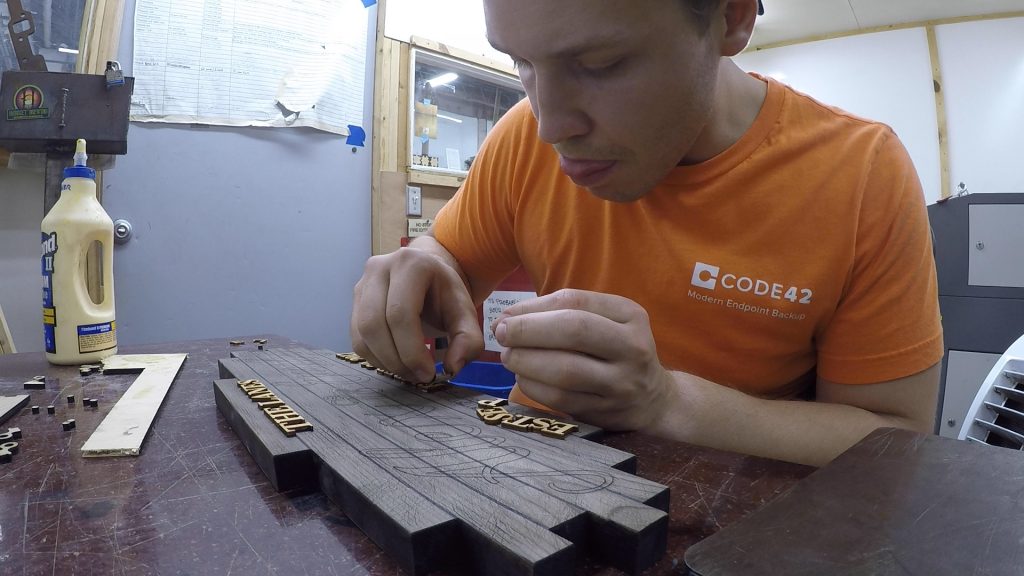
Now it was time for final assembly so I could see it in its final form! I put a good blob of glue down and used it to “finger-paint” the glue onto the small individual letters and numbers and pressed firmly until the letter no longer wanted to slide away on me. After I did five or so letters, I used a steel plate to “clamp” things down while I worked on the next series of letters. This is a pretty slow process, but it’s also semi-meditative. There aren’t many moments in woodworking that are safe to let your mind wander and think about other things, but slow-going repetitive glue ups are definitely one of them.
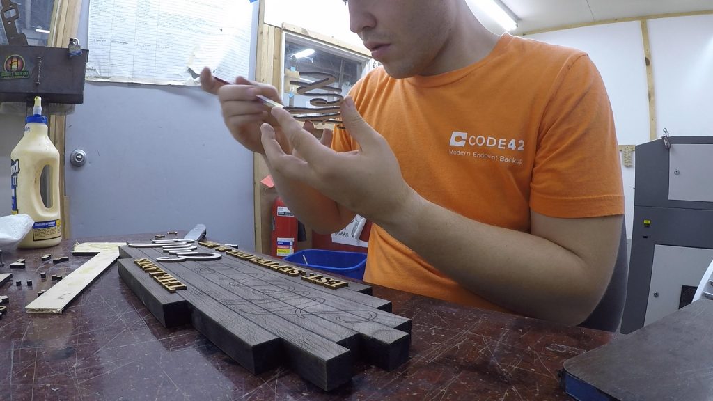
For the primary lettering, it was a large enough surface area that I decided to employ the help of a small paintbrush to apply glue.
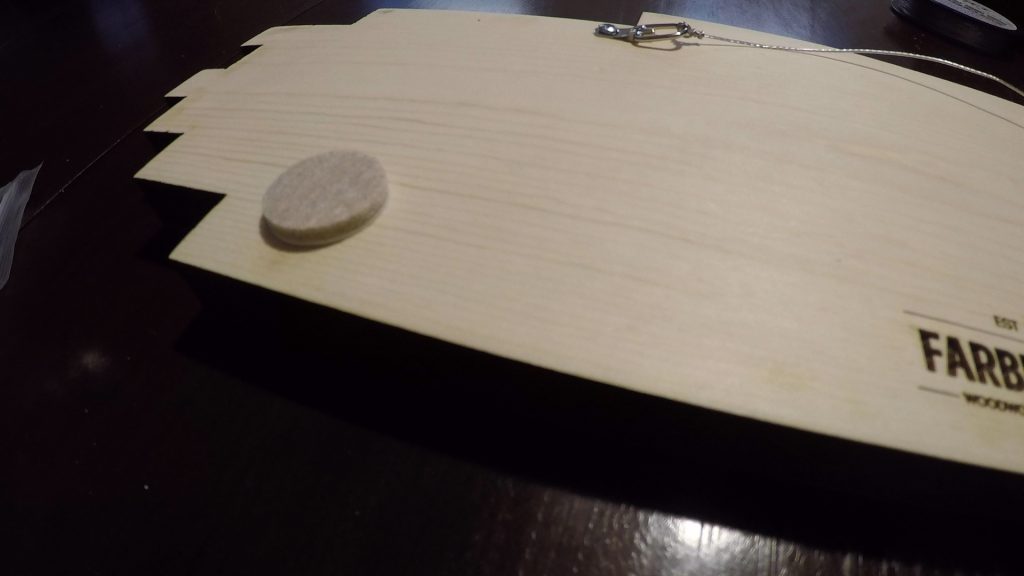
I decided to forgo any topcoat to compliment the rustic nature of the design, so after all my glue was dried it was time to apply mounting hardware. I prefer picture hanging wire most of the time as I find it’s easier for the recipient to get level on the wall. I also add adhesive felt pads to balance the vertical tilt that the wire adds and to prevent their wall from getting scuffed underneath the sign.
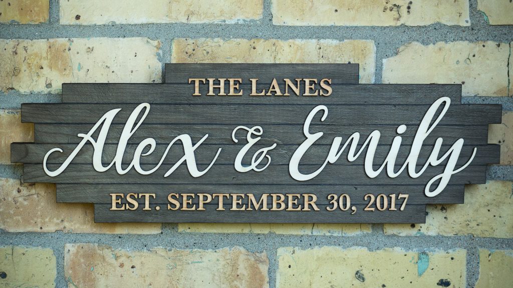
And here she is! I was really, really happy with how this turned out! It had all the character and charm I was going for while not being so rustic that it would look out of place in a modern home.
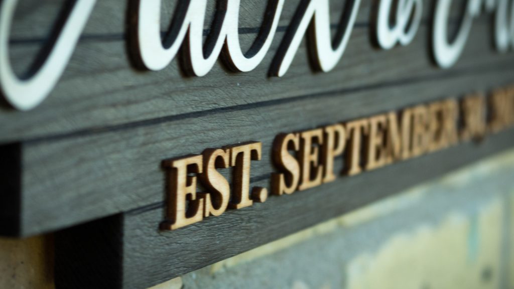
All that was left after taking a few close up glamour shots was wrapping it up in bubble wrap and kraft paper and delivering it to the new Mr. and Mrs. Lane on their wedding day. It was a beautiful wedding, and I hope this sign earned itself a home on their wall, serving as a fond reminder of their special day.
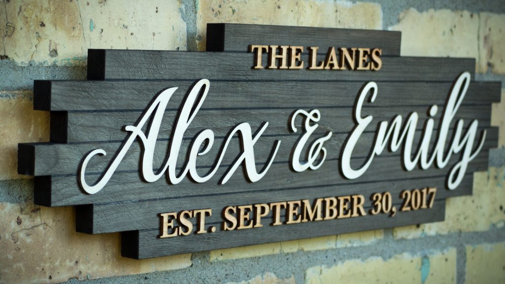
I hope you enjoyed that in-depth look at the process behind me making this wedding sign. A custom wedding sign is my go-to gift whenever we’re invited to a friend or family member’s wedding, and I put a lot of heart into every one I make, so I hope that shows in my process. These are the types of projects I love to do and post a full build video of all of my projects on YouTube. So if you’re interested in more of my work, I sure would appreciate if you subscribed to me on YouTube.
Thanks for your consideration, and until next time, cheers!
Ready to make a wedding sign yourself?
Below are links to various tools and materials used in this project to get you going. As a heads up, some are affiliate links which allows me to receive a small commission if you buy something, at no extra cost to you. Every little bit helps me continue making videos like this, so I appreciate your support and consideration!
Wire Brush Attachment: https://amzn.to/30vHnHT
Delta Electric Drill: https://amzn.to/2XWiY0n
Steel Wool: https://amzn.to/32nrfdm
Minwax Colonial Maple Wood Stain: https://amzn.to/2IAKWFj
Tightbond II Wood Glue: https://amzn.to/2xKA96B
Foam Craft Brushes: https://amzn.to/2XSHxeQ
Black Tea: https://amzn.to/2XIXxMn
